QuaiNous
A complete brand identity for a multicultural community center located in Marseille, France.
The primary goal of this identity is to celebrate the rich variety of cultures represented at the community center while reinforcing its role as a place of rest and belonging. The identity includes primary and secondary logos, an extensive color palette, carefully selected typography, and brand guidelines designed to ensure a cohesive and recognizable brand presence.
Marseille Missions Team
Brand Identity
November 2025

QuaiNous
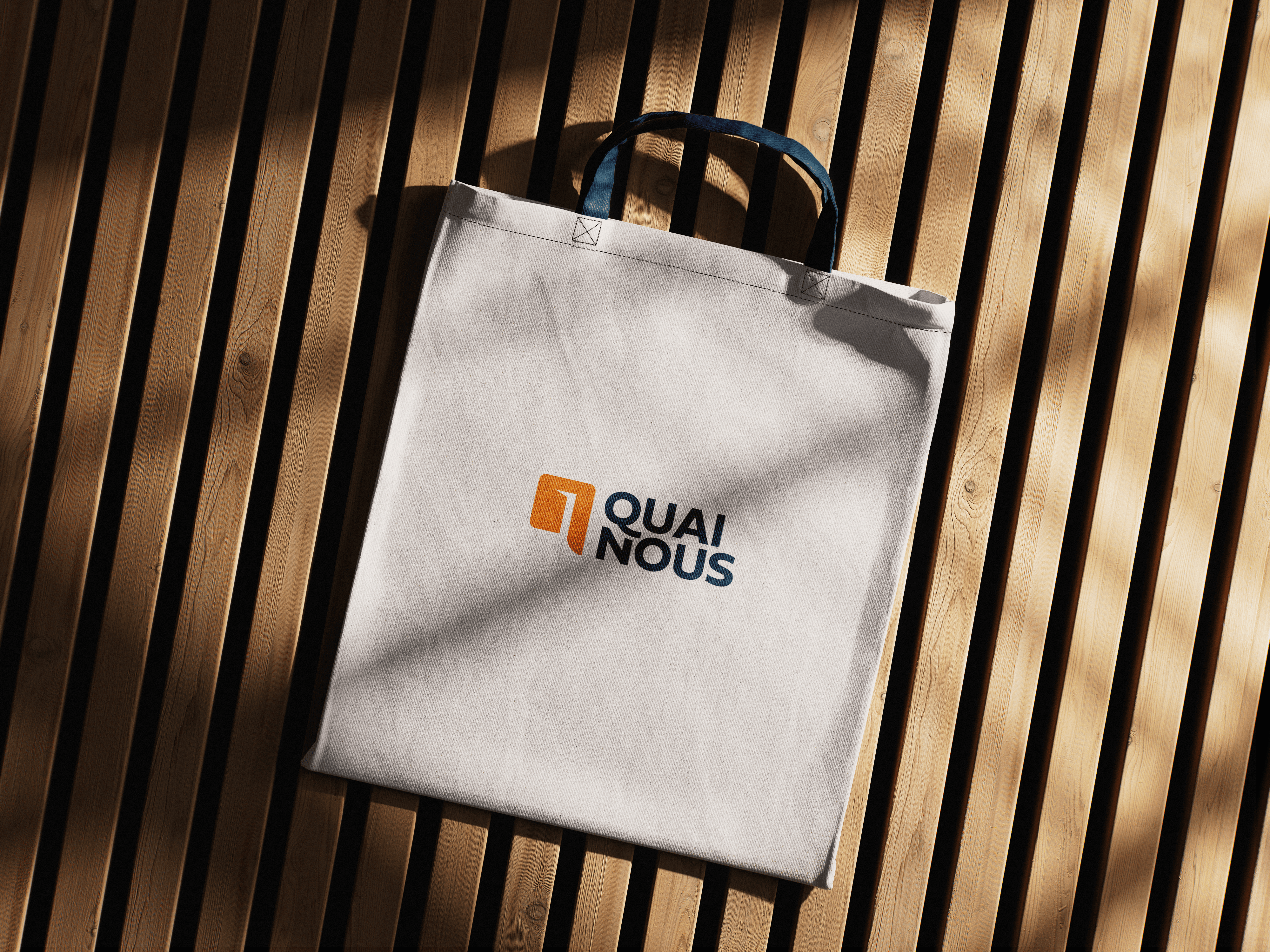
The brand name, QuaiNous, artfully combines the French words for "quay/dock” (Quai) and "us" (Nous), symbolizing new beginnings and emphasizing an inviting atmosphere. The center is committed to offering a haven of peace and belonging for all those in search of a welcoming space.
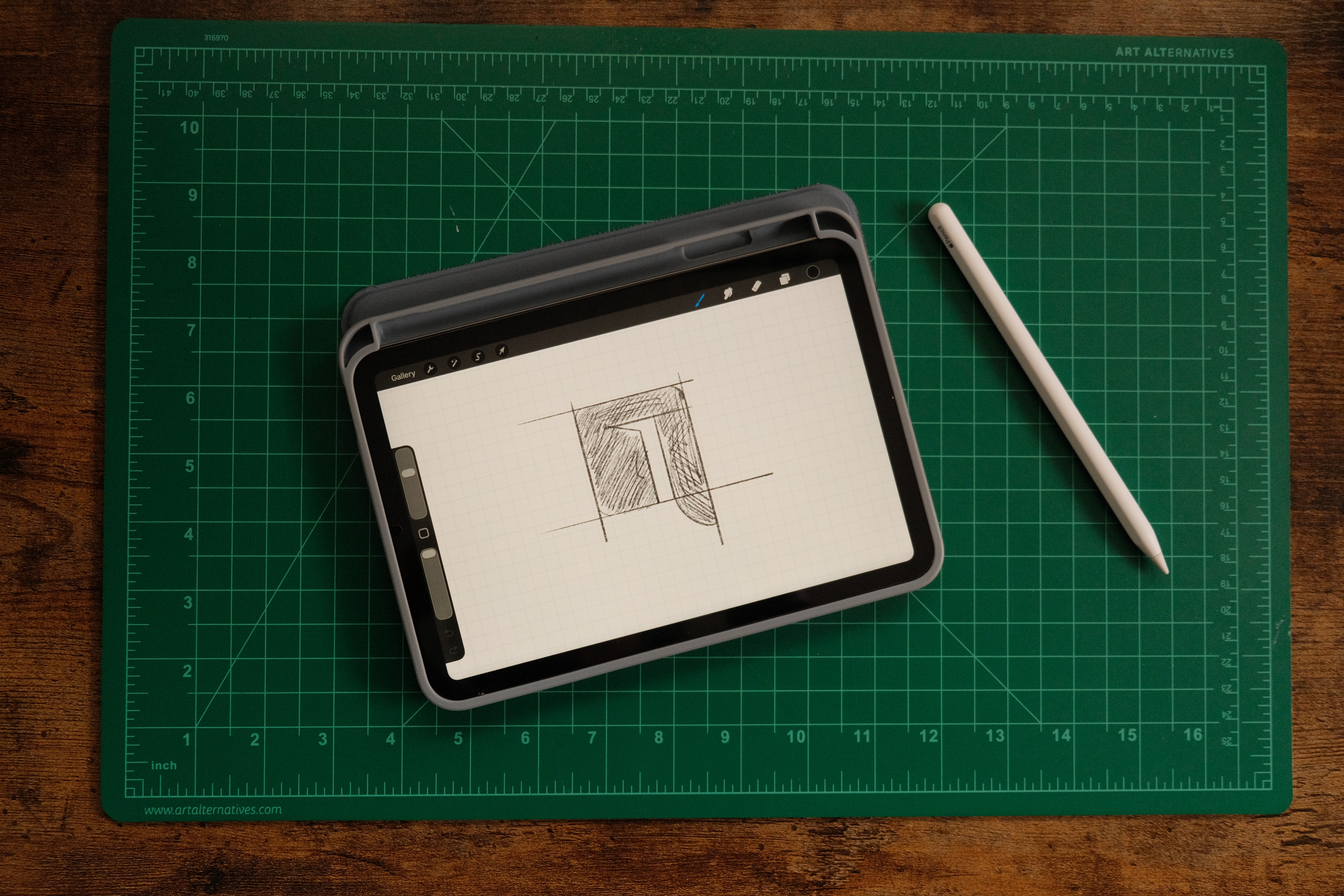
The Process
I worked alongside the QuaiNous team to ensure their brand identity matched their vision for the community center. The main logo represents both a lowercase “q” and “n,” while an open door can be found in the whitespace of the logo. This emphasizes the idea of an open-door policy and showcases the team’s commitment to creating a warm and inviting place for anyone interested.
This project was a great opportunity for me and truly challenged my creativity as I collaborated with a larger team to accommodate everything that this community center represents! It was incredibly rewarding to deliver a complete brand identity that both I and the team could be proud of!